

|
Times Have Changed: Multiple Screens Allow Marketers to Show Flexibility The use of multiple screens in peoples' everyday lives is becoming commonplace. According to a 2012 study conducted by Google and Ipsos Research entitled The New Multi-screen World: Understanding Cross-Platform Consumer Behavior, found 90% of consumers move between multiple devices-smartphones, tablets, personal/work computers, and in the near future, smart televisions-to complete tasks throughout the day. This reality is a challenge for marketers and advertisers that increasingly want to deliver a holistic experience to their target audiences across all of these devices. While strides have been made over the past year or two to use intelligence to tailor content for specific devices and even specific contexts, being able to actually track how an individual moves from screen to screen and have marketing and advertising follow that person remains a major complication.
|
|
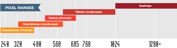
HOW-TU by Tukaiz - Employing Responsive Design What Is Responsive Design? Responsive design is a method of building highly functional websites that respond to the variety of digital screens we use today, for instance a laptop screen or a smartphone screen. It is assurance that your website serves up properly and provides optimal viewing experience. Basically, your web design needs to look good no matter how it is accessed.
|
||

|

|
How Do I Do It?
|
||||||||
|
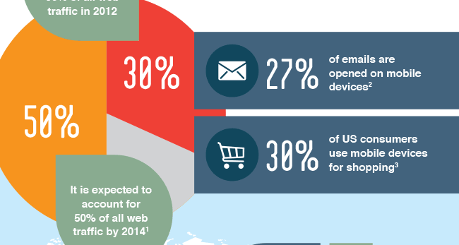
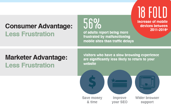
Sources: 1 (Nucleus Research via SourceCon). 2 (Sirona Consulting 2013). 3 (Nielsen Mobile Consumer Report 2013). 4 (Cisco). 5 (Bravenewcode Mobile Joomla study 2012). |
||||||||
|
||||||||


Want to learn more about the suite of marketing communications services offered by Tukaiz?
Visit our website at www.tukaiz.com or send an email to getinfo@tukaiz.com.
©2013 Tukaiz LLC · Imaging. Print. Interactive.
2917 Latoria Lane Franklin Park, IL 60131
www.tukaiz.com
Privacy Policy | Terms and Conditions
%%PLUGIN_Unsubscribe: 1651-UNSUBSCRIBE%%